Thursday, 20 July 2017

Iconography of an album cover

The art of an album cover is a curious one. Part packaging, part advertising, often an insight into an artist's world view and usually the happy result of a successful collaboration between creative minds, the best album cover art illustrates and accompanies the music in a way that creates a whole package. Julian House states how most of the direction of a music cover must be taken from the artists themselves. He also explains how an Album sleeve is an entry point into the universe that the music is and how it is a wind into the themes an ideas of an artist.

Deconstructing album cover Art:

Album covers can be extremely various, utilising photos, graphics, typography, or any combination of these. As a type of media text, it can be deconstructed like any other. When analysing it, we can use the same tools we'd use to analyse and understand any visual media text

Associations and connotations:

Denotation- means simply identifying the elements in the image, and connotation means examining what meanings and associations they might link to. On a hip-hop cover it may well have connotations of conspicuous wealth and extravagance, given that genre's conventions (50 cent)

Signs, Symbols and Codes:

A sign is a representation that refers to something else and has meaning. A code means the structure of how signs are organised into systems to make meaning. These are usually divided into the technical and the symbolic  (pink Floyd)

Composition and Framing:

This focuses on the construction of the album cover, e.g. light, shadow and colour. We refer to conventions are established ways of doing things, in this case they mean established forms of presenting an image. it can be helpful to examine how closely any given image tracks the conventions you'd associate it with. (Courtney Barnett)


Examples:

Pink Floyd 'The dark side of the moon' was inspired by a physics textbook, and the bands desire to use a simple design rather than a photograph. This famous cover also nods to Pink Floyd famous light shows.


John Coltrane 'Blue Train' - with its bold typography, simple colour scheme and striking, high contrast photography, this is a classic example of the iconic work of Miles and Wolff which defines the classic 'blue note' look of this period


Organic vs Synthetic artists


Organic and Synthetic Acts:
  • There are clear distinct between the ways in which different types of artists are represented to ensure shot term of long term success 
  • Organic acts are often sold on their 'authenticity', both musically and socially.
  • The image of the artists appears 'unconstructed' (although, of course, this is in itself a carefully constructed look)
  • Synthetic acts are often sold on their 'look' or personalities 
  • The image of the artists is carefully and unashamedly constructed. 
Synthetic bands: 
  • One Directions 
  • JLS 
  • The wanted 
  • Take That 
  • Girls Aloud 
  • The Saturdays  
  • Spice Girls
  • S Club 7 P
-Often aimed at younger, less sophisticated audiences 
- Profits generated by this kind of artist tend to be part of an immediate, short term strategy by the record company. This is because the audience grows up and eventually out grows the artist. 
- Executives attempt to consrct successful acts out of the artists and the songs at their disposal 
- The image of the artist is often constructed by the record company 
- The artists will be given a short time to prove their success before other combinations will be tried out. 

Organic Bands: 
  • Oasis 
  • U2 
  • Blur
  • Mumford and Sons 
  • Bastille
  • Beatles 
  • Pink Floyd 
  • Artic Monkeys 
  • Guns and Roses 
- They are considered to be more natural 
- The seeds of success within the artists, who have to be 'nurtured' by the record company 
- The image of the artists is enhanced by the record company 
- The artist is given time to evolve and progress though their career. This is because they recognise their fan base will continue to grow and evolve over time. 

Music Video analysis


Bon Appetit - Katy Perry

In this video, the star image of the artist is that she is good looking enough that someone would eat off of her. She is dressed in a way that also supports this idea as she is wearing little to no clothes (male gaze). The colours within the video represent the genre of which Katy Perry represents, which is pop. For example, the light and dark colours contrast each other, this symbolises the differences between women who are sexualised and women who are not around the world. The narrative of the video portrays Katy Perry as a sex icon as everyone looks after her, making sure she looks good enough for the world. The end product being so good that men who lust after her can even eat off of her body. Furthermore, the popular rap group 'Migos' have their part in the song and feature in the music video. They represent the type of people who want women like Katy Perry.


Moreover, throughout the music video, different editing techniques are used which help cut to the beat of the song. Also, freeze-frames on the artist and quick cuts between different locations is another example of the way in which we see the high production values of the music video which further demonstrates the way in which it is aimed at a mainstream target audience. Lastly, the fact that she isn't wearing much clothes throughout the whole video demonstrates that the target audience is for teenagers and younger people.

Artists Websites


Oasis and Nicki Minaj:


 Similarities:

  • Both websites advertise tour dates with locations.
  • Both include a picture of the band/artist
  • Both have links to social media
  • Both advertise sale of merchandise 
  • Both advertise to buy current songs that are popular

Differences:


  • Nicki has a very colourful website where as Oasis is based around dark colours.
  • The name of the artist is in the biggest writing in her website where as the album name is the biggest writing in the bands website. 
  • Oasis are wearing clothes that cover most there skin where as nicki is wearing a revealing top, this is trying to sell her sexually (scopophilia)
  • The picture of the artist of oasis is based around them performing and playing music where as her picture is about just her with her low cut top and colourful outfit. Differences in approach. 

After analysing contrasting websites of organic and synthetic artists, I have come to the conclusion that i want my website/album cover to be organic rather than synthetic because fans of organic bands like them for there music. Synthetic artists have to reveal details about their personal life in order to gain followers and their fans are short term and grow up quickly where as an organic bands fans are mature and will still enjoy the music as they get older. Overall, it is a lot more reliable being a successful organic artist rather than synthetic because people like you for your unique music style where as with synthetic artists, someone cooler or better looking could come along and all your fans would disappear. 

Wednesday, 12 July 2017

Rule of Thirds and Album Covers

The rule of thirds is a concept in video and film production in which the frame is divided into nine imaginary sections, as illustrated on the right. This creates reference points which act as guides for framing the image.
Points of interest should occur at 1/3 or 2/3 of the way up (or across) the frame, rather than in the centre. Like many rules of framing, this is not always necessary (or desirable) but it is one of those rules you should understand well before you break it.
In most "people shots", the main line of interest is the line going through the eyes. In this shot, the eyes are placed approximately 1/3 of the way down the frame.
Depending on the type of shot, it's not always possible to place the eyes like this.
In this shot, the building takes up approximately 1/3 of the frame and the sky takes up the rest. This could be a weather shot, in which the subject is actually the sky.

Image result for album covers
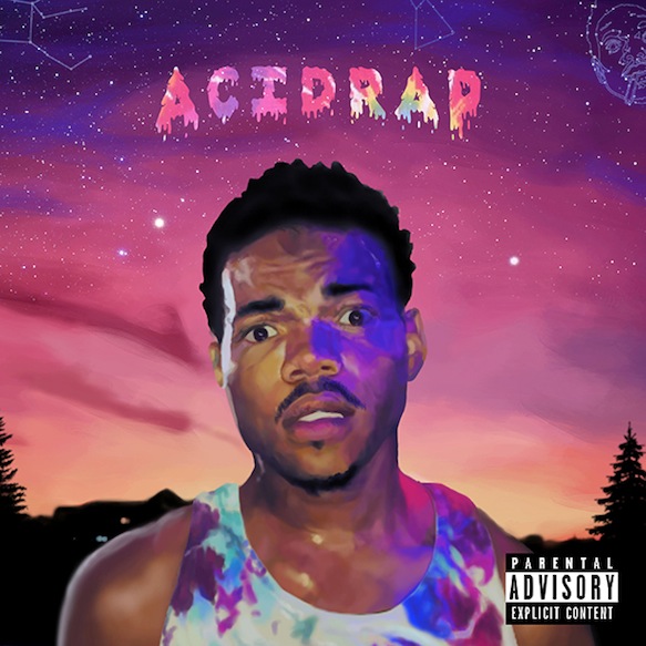
The rule of thirds is interpreted differently by synthetic artists in comparison to organic. As seen here, this synthetic artist has based his album cover around his face as it is the biggest thing in the picture and is focused in the centre third where everyone looks first when they see a poster. This synthetic artist has chosen for it to be designed like this because the album is more about selling him as a person rather than his music. Him as a synthetic artist means that he is trying to sell his star image therefore to do this; he is exposing his shoulders so it is more revealing so people also buy his album because they are attracted to him in the cover. However, there is an argument that he does care about his music rather than his image because the whole upper third is album name and as nothing to do with his star image. 

Image result for oasis first album cover
This album cover conforms to the rule of thirds. This organic band show they are different through the placement of objects and titles in this cover. The middle third where people look first consists of a man sitting on the couch playing guitar. This is the major part of the cover and it connotes originality as they care about the music they make rather than their star image and how they are visually perceived. The use of the bold black and white in the top third shows that they want people to notice the album and band name as this is the reason they want to be well known. The colours contrast to the rest of the cover.  

Lip Syncing Prelim


Me and my group filmed our prelim music video on an iPhone using an app called video star. The reasoning for the app we chose was primarily because it was free which enables us to add filters and a song for no cost. As a group we chose to do the song ‘Rude’ by Magic, this was because we all liked the meaning behind it, and the artists, which made it easier to create the actual lip-synching video. This song was a good idea as it was a popular song and well known so we were able to know the words as well as knowing what it was about. We used Matthew as the male actor in our video because the singer is male in the actual song. The roles within our group were split so everyone had something to do which enabled us to work well as a group.
We used different shots like low angles to represent the power of the male in the video and the other male has a high angle to show that he was weaker and that the dad overpowers the boy. We used two spare actors in the video to make it more realistic that there were more people involved in the situation. For example the daughter/girlfriend. I think that both Matthew and I were good when we lip-synched, as it was our first time although there were bits out of sync. We chose ourselves as the actors because we are both males which enabled the task to make more sense due to the song is an argument between two men. This was a good draft as it enabled us to improve for our actual music video.
When filming we went around to a couple of different locations to give the video a setting as well as getting different lighting in the video. For our final task, we would have created a storyboard and planned the music video which we didn’t do as we didn’t have the allocated time given, which is why it was messy and bits were not in time.
Overall, I am very happy with how our first draft turned out as it enabled us to see what our music video should include and what it shouldn’t. I am able to benefit from it in the future like when we are planning our final video in advance and getting people to lip synch who are used to it (actors). This task taught me new skills and it enabled us to work as a group in an efficient way.